Button Link
A button link is a link that looks like a button. It is used to link to other pages or resources.

Usage
<x-button-link.primary href="{{ route('home') }}" class="my-6 mx-auto inline-block">
    {{ __('Home') }}
</x-button-link.primary>
You can pass in extra classes to the button link component to customize it's look and feel.
The button link component accepts the following attributes:
href- the link to the page or resource.class- the extra classes to customize the look and feel of the button link.hoverEffect- whether to show the hover effect or not. This is used to determine if the button link should show the hover effect or not.elementType- the element type to use for the button link. This is used to determine the element type to use for the button link. The default isa, but you can usebuttonif you want to use a button element instead.
Variants
The button link component comes in the following variants:
Primary
Primary button links use the primary color bg-primary-500 (TailwindCSS color class).
<x-button-link.primary href="{{ route('home') }}" class="my-6 mx-auto inline-block">
    {{ __('Home') }}
</x-button-link.primary>
Secondary
Secondary button links use the secondary color bg-secondary-500
<x-button-link.secondary href="{{ route('home') }}" class="my-6 mx-auto inline-block">
    {{ __('Home') }}
</x-button-link.secondary>
Outline
Outline button links use the outline color border-primary-500 text-primary-500

<x-button-link.primary-outline href="" class="my-6 mx-auto inline-block">
    {{ __('Watch Video') }}
</x-button-link.primary-outline>
Glowing (Primary)
Glowing button links use the glowing effect (with the primary color). They are used to draw attention, best used for call to actions.
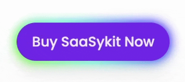
<x-button-link.glowing.primary href="#">
    {{ __('Buy SaaSykit Now') }}
</x-button-link.glowing.primary>
Glowing (Secondary)
Glowing button links use the glowing effect (with the secondary color). They are used to draw attention, best used for call to actions.
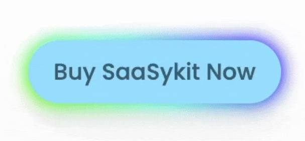
<x-button-link.glowing.secondary href="#">
    {{ __('Buy SaaSykit Now') }}
</x-button-link.glowing.secondary>
Glowing (Outline)
This variant of the glowing button link comes with an outline glow effect. It is used to draw attention, but less prominent than the glowing button links above.

<x-button-link.glowing-outline href="" class="mt-16">
    {{ __('Buy SaaSykit Now') }}
</x-button-link.glowing-outline>