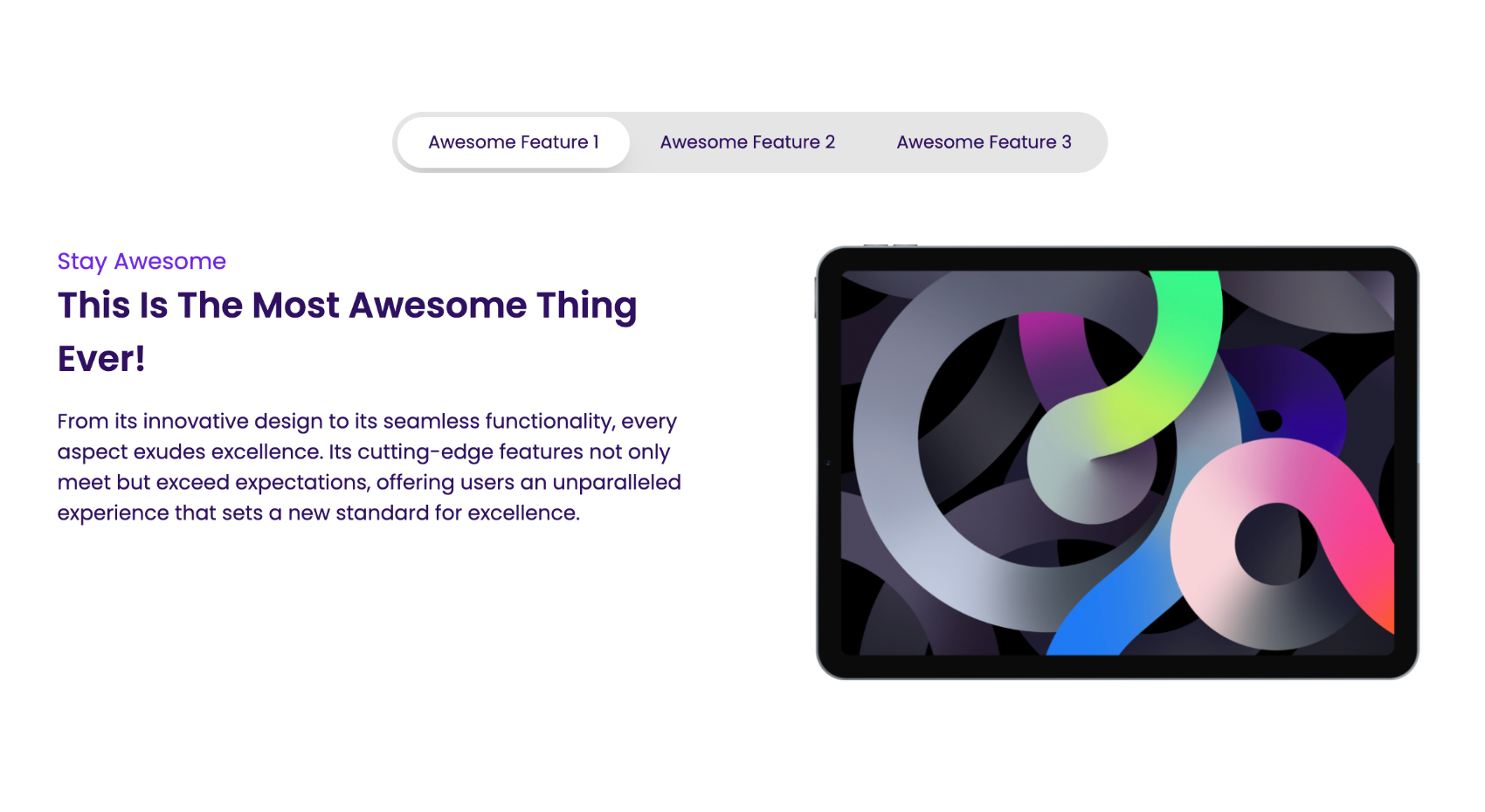
Tab Slider
A tab slider component is used to display a multi-tab section.
Usage
<x-tab-slider class="mt-6 md:max-w-6xl">
    <x-slot name="tabNames">
        <x-tab-slider.tab-name controls="tab-1" active="true">{{ __('Payments') }}</x-tab-slider.tab-name>
        <x-tab-slider.tab-name controls="tab-2">{{ __('Dashboard') }}</x-tab-slider.tab-name>
    </x-slot>

    <x-tab-slider.tab-content id="tab-1">
        <x-heading.h3 class="text-primary-900">
            {{ __('Tab 1') }}
        </x-heading.h3>
        <p class="mt-2">Lorem Ipsum is simply dummy text of the printing.</p>
    </x-tab-slider.tab-content>

    <x-tab-slider.tab-content id="tab-2">
        <x-heading.h3 class="text-primary-900">
            {{ __('Tab 2') }}
        </x-heading.h3>
        <p class="mt-2">Lorem Ipsum is simply dummy text of the printing.</p>
    </x-tab-slider.tab-content>
</x-tab-slider>
Inside a the slot tabNames you can define the tab names. Each tab name should have a controls attribute that points to the id of the tab content it controls. You can also pass in an active attribute to the tab name that should be active by default.
Inside the tab-content component you can define the content of the tab. Each tab content should have an id attribute that matches the controls attribute of the tab name that controls it.
You can pass in extra classes to the tab-slider component to customize its look and feel.